Suffice it to say you will not make a good impression with me by singing the praises of Ronald Reagan. I don’t think he was evil, I think he had an ideology that he truly believed would lead to a better America Afghanistan and our relations in Iran
I once got into a discussion with an elder cousin of mine about graphic novels. I was trying to explain to him that graphic novels could have just as much literary merit as traditional novels. He felt that if the literature was good enough it could stand on it’s own in a standard format. I tried to point out that displaying things graphically often frees the author of the burden of exposition while engrossing the reader in the world. I pointed to The Hobbit as I prime example of exposition destroying the momentum of piece. It is cliché for a reason; a picture really is worth a thousand words.

This graph shows how the tax bracket system has changed for the last century. The x-axis show the year, The y-axis indicates the yearly income, and the color displays how much taxes are collected for income in that range. I’ve been trying figure out how to describe the radical change in our tax code as a result of Reagan’s policies for the last four months, but it’s hard without showing lots and lots of numbers. Not exactly a flowing narrative. In 1986 our tax code changed from a gradual progressive system to a system that gives the wealthy in this country a virtual free ride. Reagan’s tax policy was unprecedented, not only was it the first time 50 years that taxes have been so low but it was the first time the rich paid less than the middle class without the benefit of creative accounting. By the time Reagan was done the wealthy in this country were paying 28% on their income above $150,000, while the middle class was paying 33% on their income. This is what we know as Reaganomics, a notion that lowering the taxes on the rich would lead to prosperity for all.
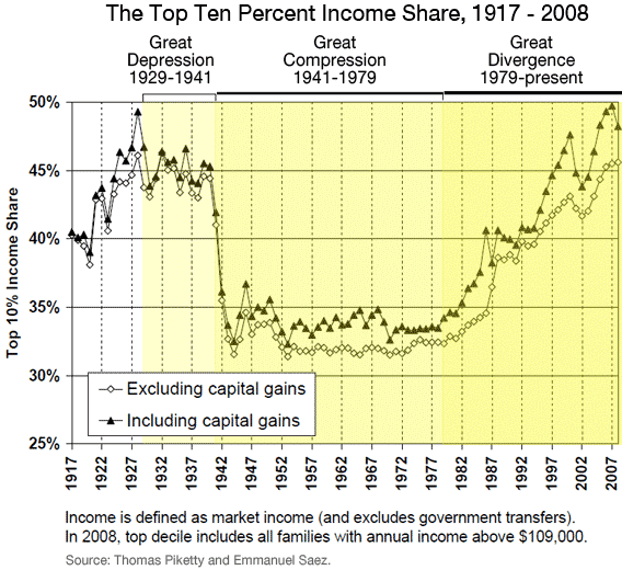
Some may argue that some measure of prosperity has come for all. The fact that Americans all can afford flat screen TVs, iphones, and SUV’s are a sign of tremendous prosperity for all. I’d argue the affordability of high-end products points more to increases in efficiency in production then to overall prosperity. The only way to judge prosperity for all is to look at the distribution of wealth:
 |
| Info courtesy of slate.com |
Again graphs really draw into sharp relief the change in the distribution of wealth in this country over the last 30 years.
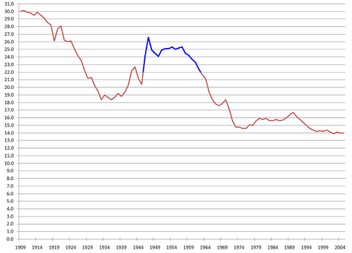
However the consequences of Reagan’s policies extend far beyond the redistribution of wealth upward. Social Security is in crisis. The reasons are complex, but knowable. A lot of people think Social Security is going broke because it was based on a ponzi scheme. This is not true. The reason why social security is going broke is because in very short time it will start to give out more than it takes in. Again the reasons why this will be the case are many but very easy to understand. First off let’s start with what has changed in social security; nothing except the population. The baby boomers are coming to the age where they are going to begin collecting social security. The problems of social security are tied directly to what the baby boomers are. The Baby boomers are a statistical cohort defined by a large bump in our population. The consequence of this boom was and increase in the amount of money coming into the social security program then was going out to its participant. In other words there were a lot more people working and paying into the program then were retired and collecting from it. Time however keeps on marching, and because the baby boom eventually stopped we are now at a point where there will be more people retired collecting from it then in the work force paying into it.
 |
| United States birth rate (births per 1000 population). The United States Census Bureau |
But wait a minute if the baby boomers put in more then their elders took out where did that money go? We spent it. On what you ask, well mostly in low taxes for the wealthy. To understand how that happened the first thing you need to know is governments can’t really save money. This is not an example of government’s fiscal ineptitude, but a matter of practicality. When the average person put’s their money into a savings account at a bank they are entrusting the bank with the responsibility of ensuring that money stays there. The bank does this in two ways; it invests a portion of that money in things that are safe and most likely to retain value, the safest thing being U.S treasury bonds. The second thing it does is have insurance from the federal government to cover all obligations up to 100,000 dollars. So basically if the government wants to save money it needs to invest it in something safe and the safest thing it can invest in is U.S. Bonds. Except the purpose of U.S.
The thing is although Reagan changed our tax system radically our perception of the tax system hasn’t changed. Popular wisdom is still that our current tax system severely punishes the wealthy in this country for their success and any increases in their tax rate would stifle creativity. However let’s take a look back at the first chart. It is important to note that the income axis is in logarithmic scale. So while it appears that a large portion of the graph was taxed at admittedly stifling 90% at points in our history, on the whole this was only felt by people earning over a million dollars yearly or nearly 20 times the national average.
As we discussed back in shoot the hostage the size of government has been relatively constant for the last 30 years. Our Debt and deficit problems have less to do with our spending policies today and more to do with our tax cuts in the past. As I’ve stated before the government rarely does things because nobody wants them done. However our policy of low taxes on the wealthy has left government programs with a starvation philosophy. When times are lean they only spend on what breaks, leaving the things that need maintenance to languish until they too break, which often results in greater costs. At the same time when times are fat they spend any excess frivolously because it is not known when they will once again be cut off. The result has been a slow degradation of our infrastructure.
Our government has monumental problems to solve, we need to improve our failing schools, replace our infrastructure, two wars to conclude, and reduce our debt. I truly believe in the innovation of this country but there is no reason to hobble ourselves by relying on a tax system that figuratively ties one hand behind our back.


No comments:
Post a Comment